About the Brand
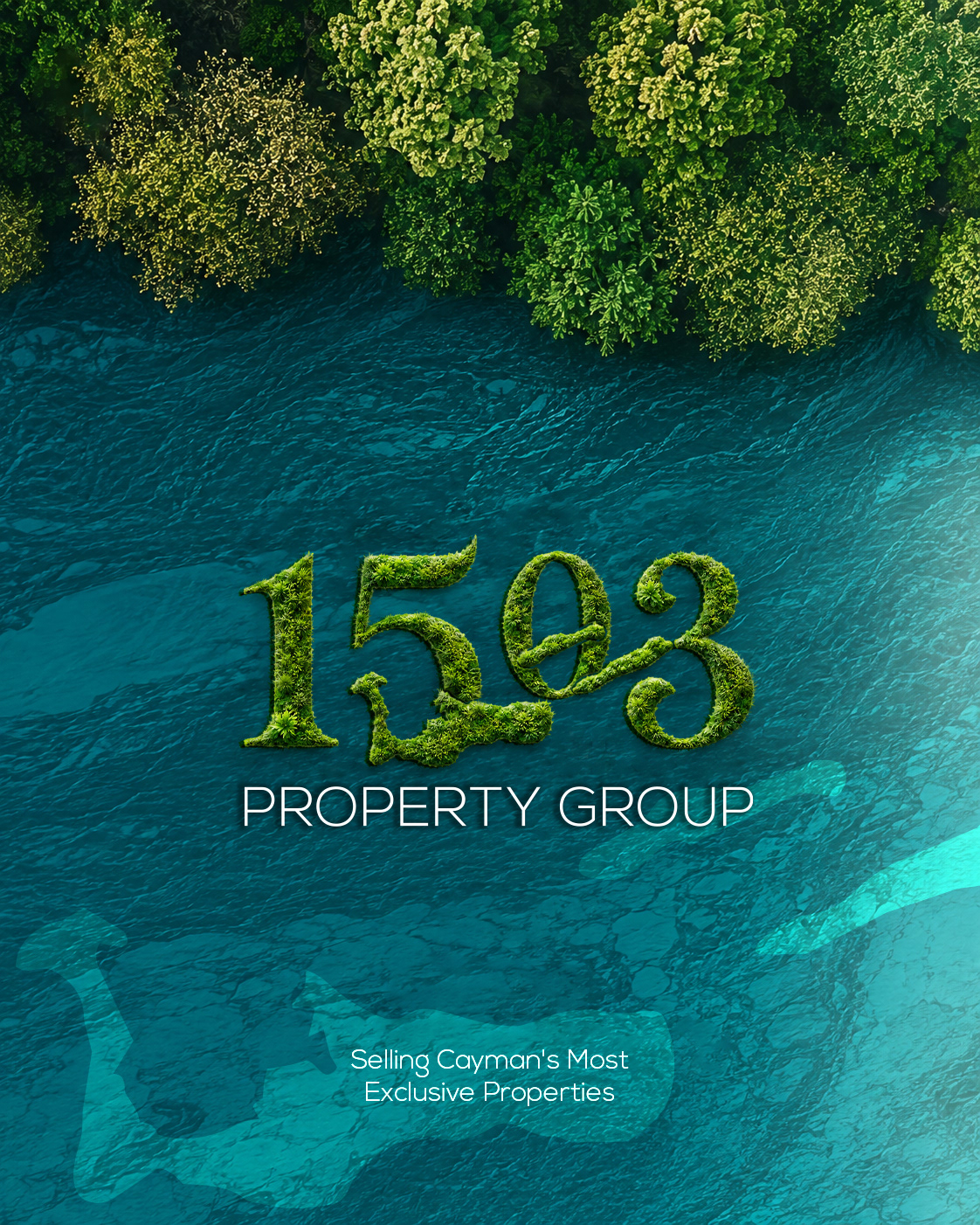
1503 Property Group is a luxury real estate brand selling exclusive properties across the Cayman Islands — beachfront estates, private villas, and high-value investments. The name marks 1503, the year the islands were first discovered — a nod to legacy and place. The identity needed to feel as rooted in the islands as the properties it represents.
Brand Mission (Redesign)
Make 1503 feel indigenous to the Cayman Islands, not imported into it. Most real estate brands in this market default to the same navy-and-gold, palm-tree visual language. 1503 needed to look like it belongs to the land — not like it's selling a lifestyle from a stock photo.
Three commitments guided the mission:
Heritage over trend — anchor the brand in 1503, the year of discovery.
Landscape as logo — turn the islands' geography into a recognizable asset.
Earth-first luxury — trade gold-and-navy cues for Earth Green, Linen, and Black — colors pulled from the islands themselves.
Landscape as logo — turn the islands' geography into a recognizable asset.
Earth-first luxury — trade gold-and-navy cues for Earth Green, Linen, and Black — colors pulled from the islands themselves.
Designer Vision & Project Intent
Core idea: the Cayman Islands' own shape becomes the brand's most valuable asset.
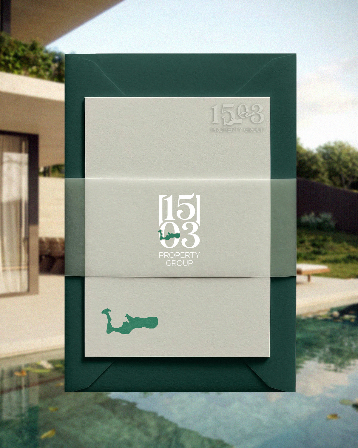
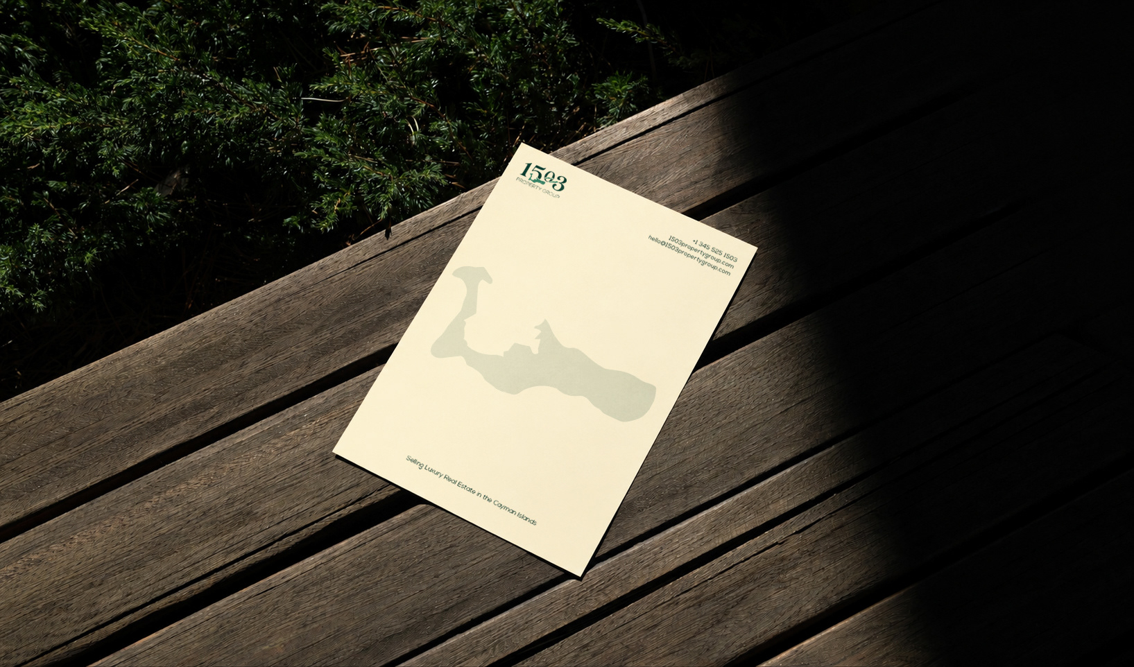
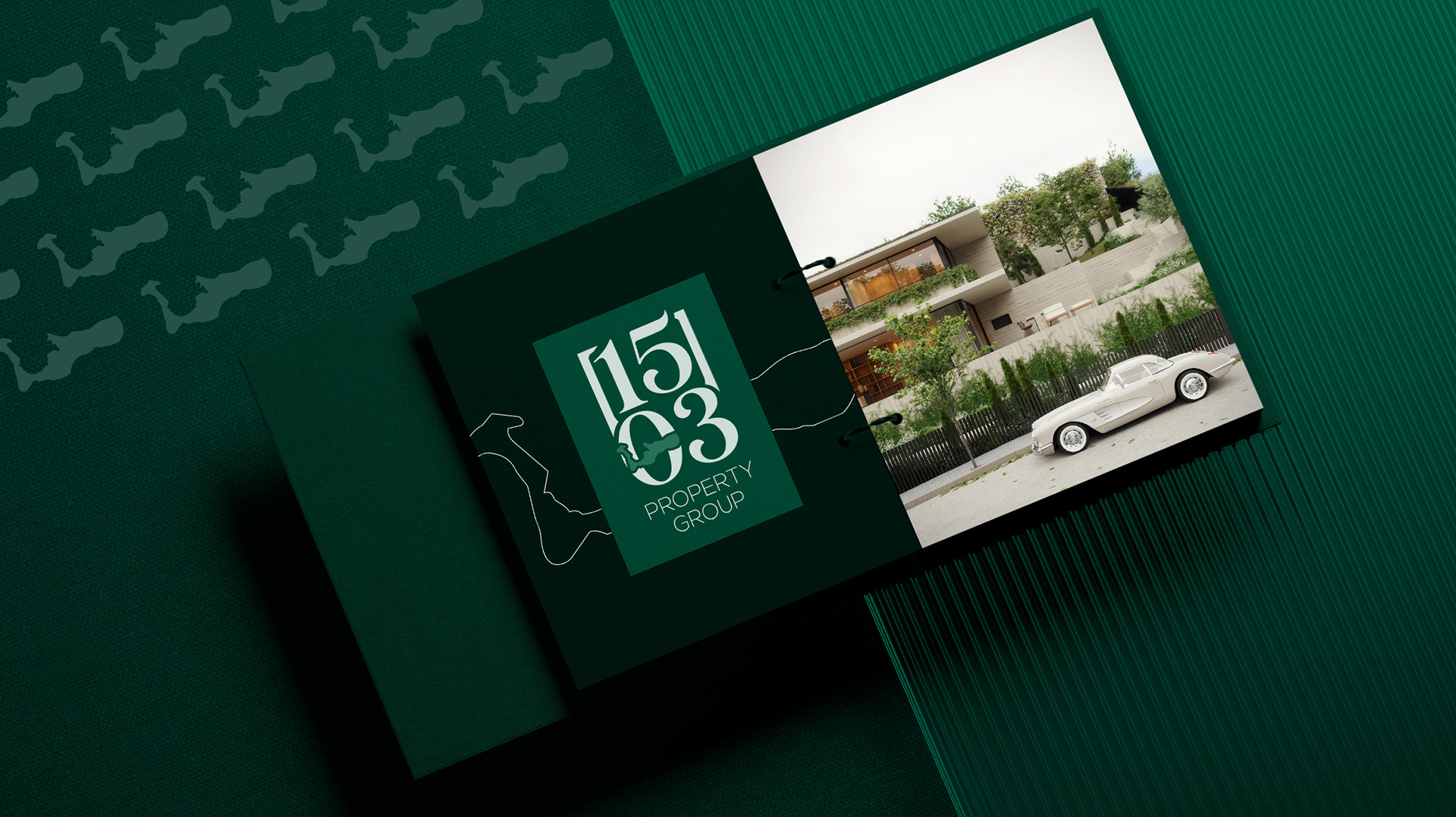
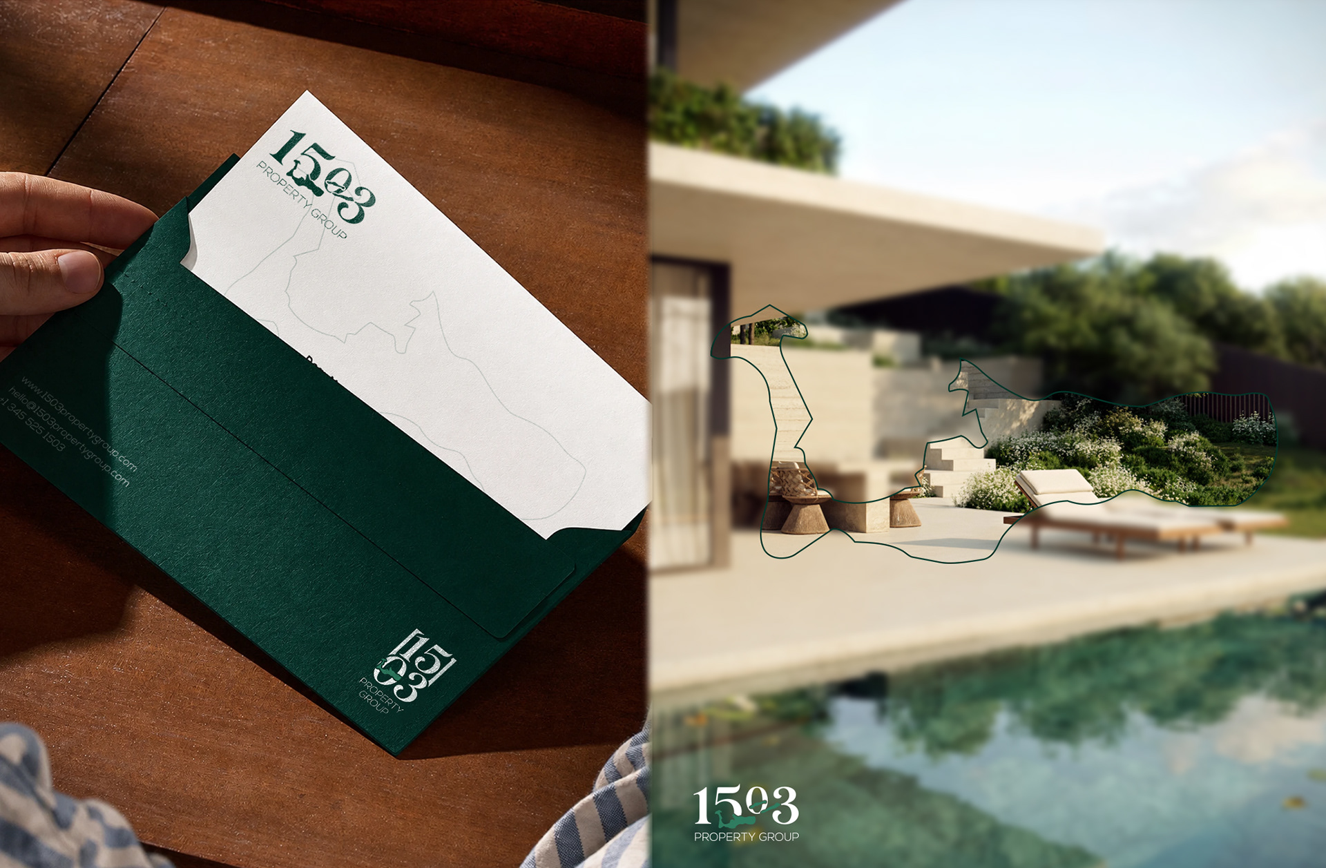
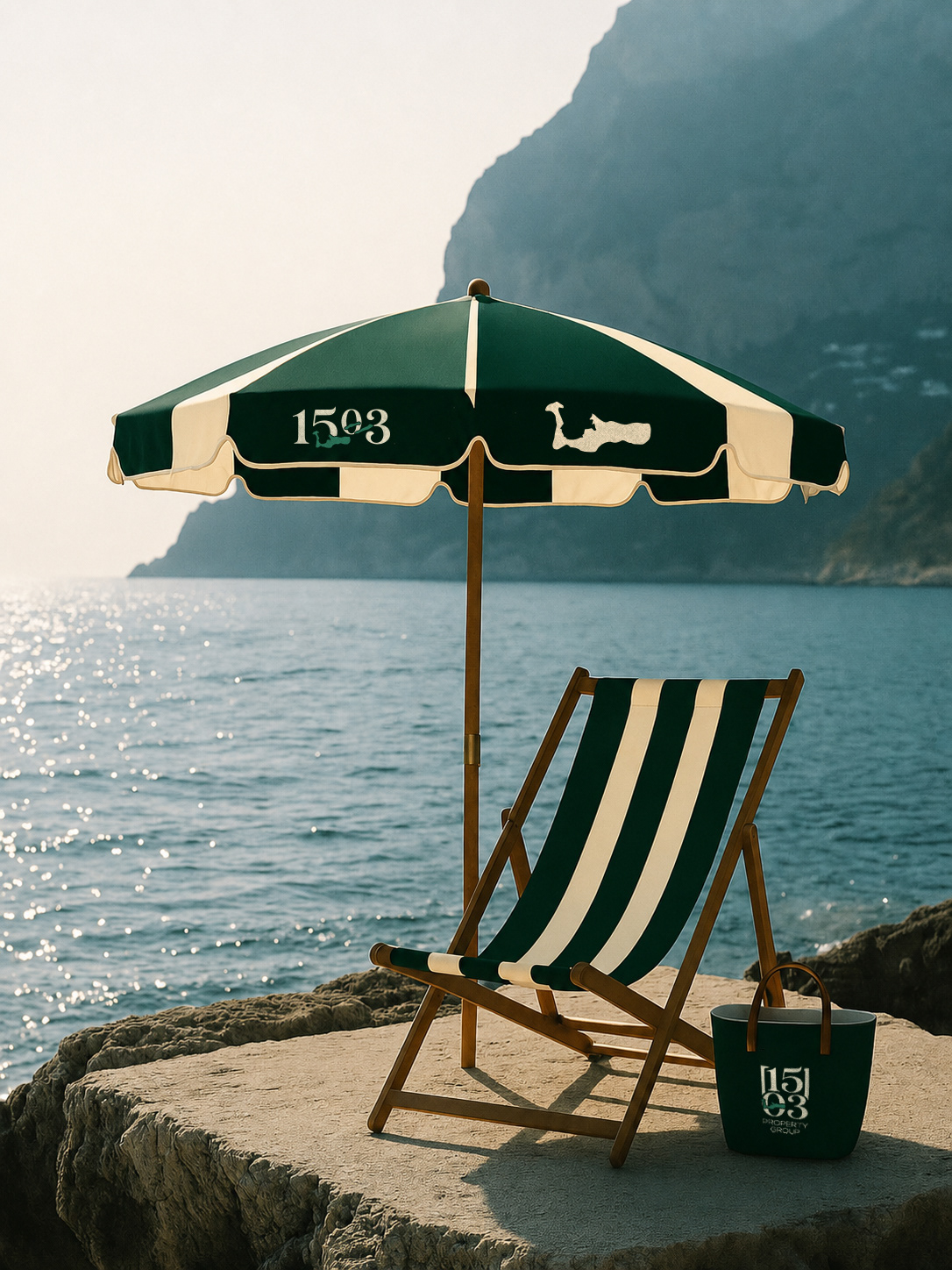
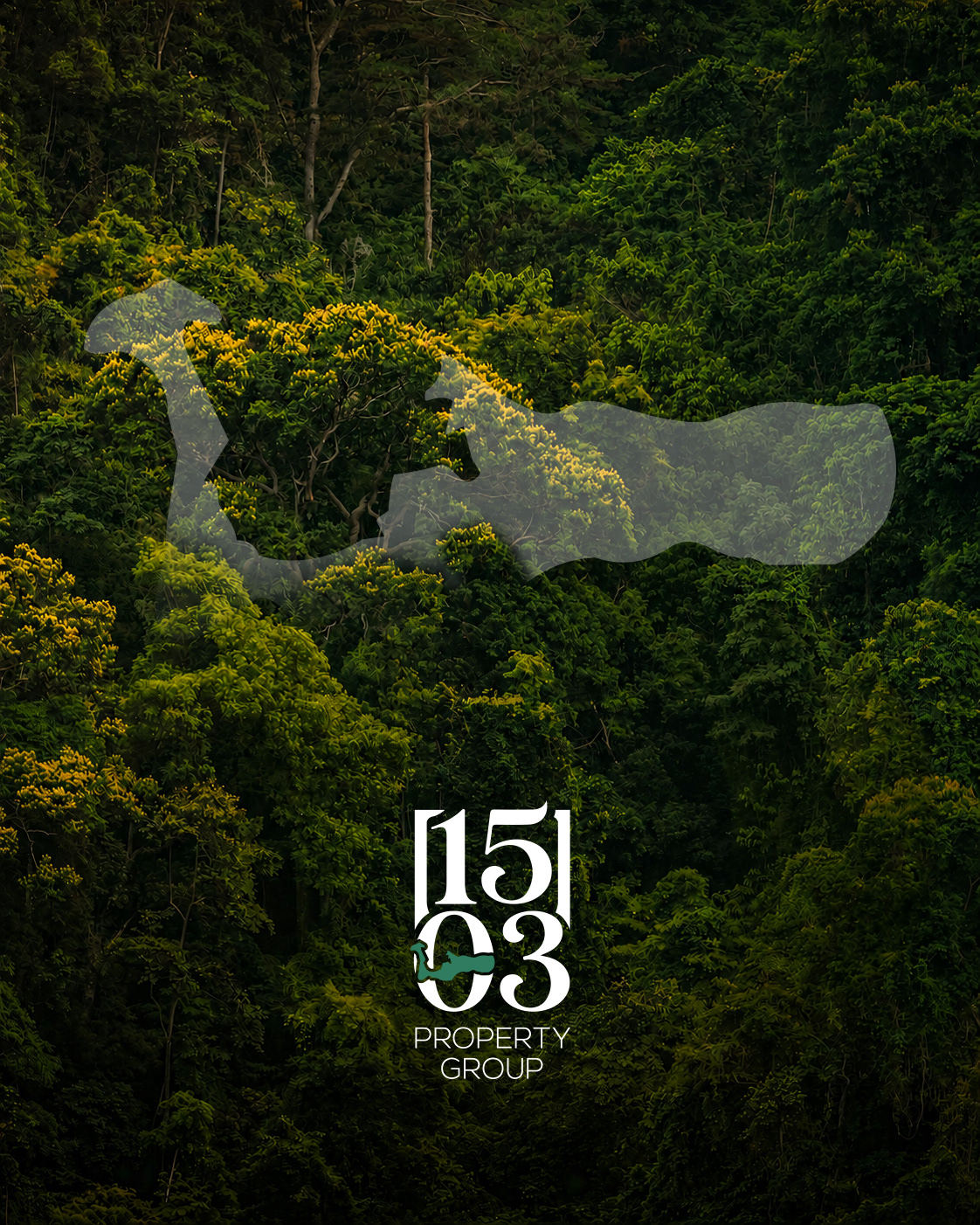
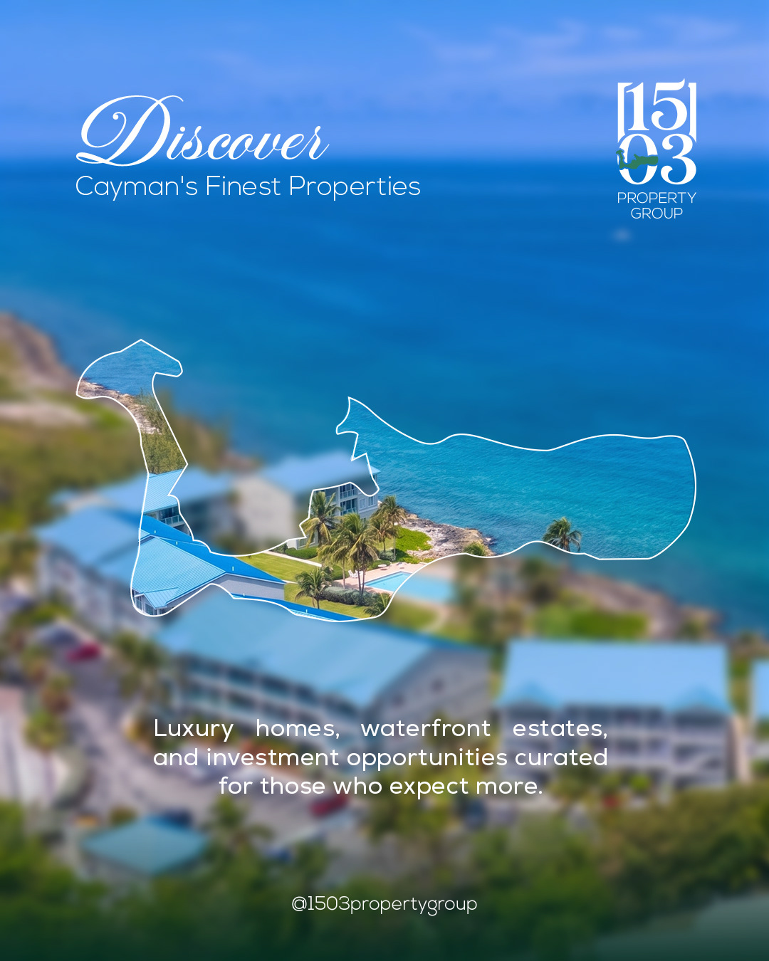
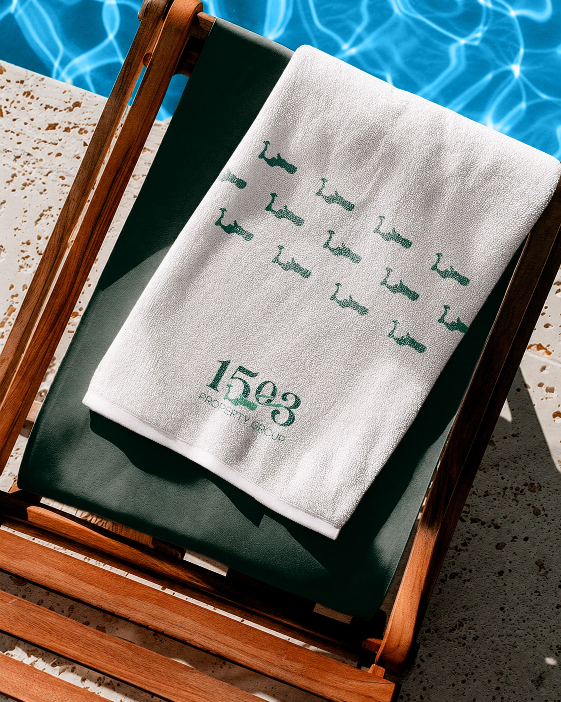
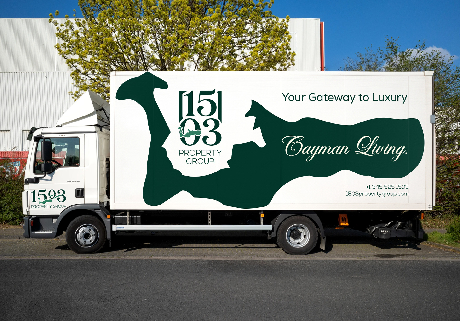
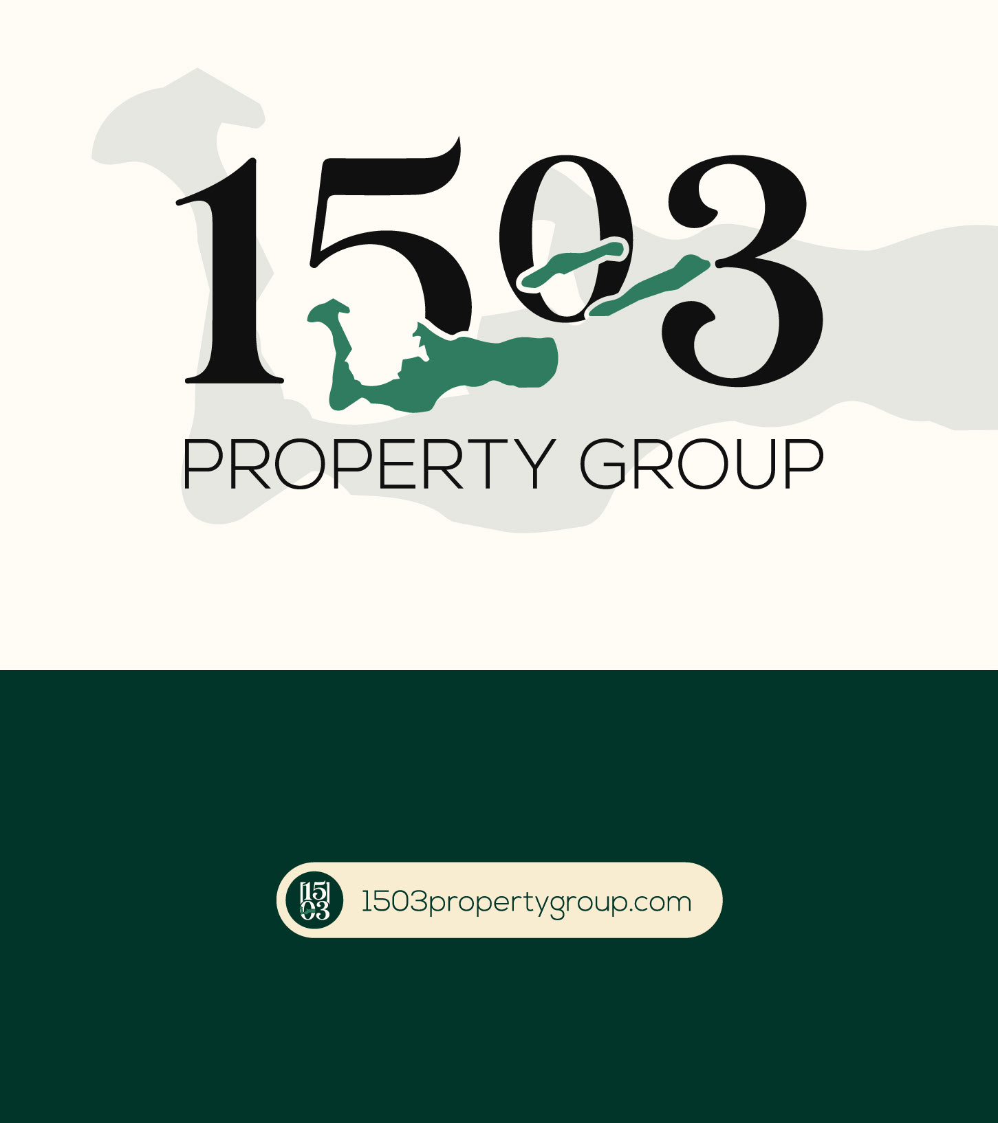
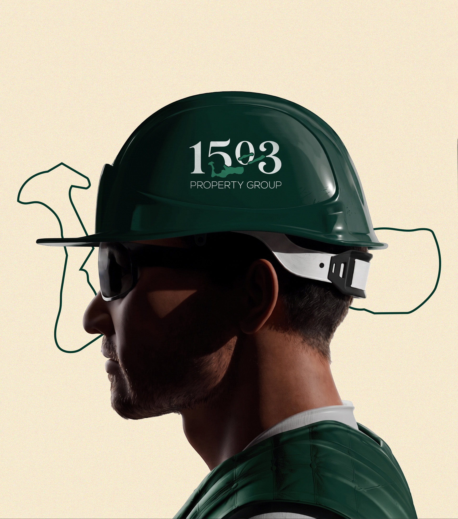
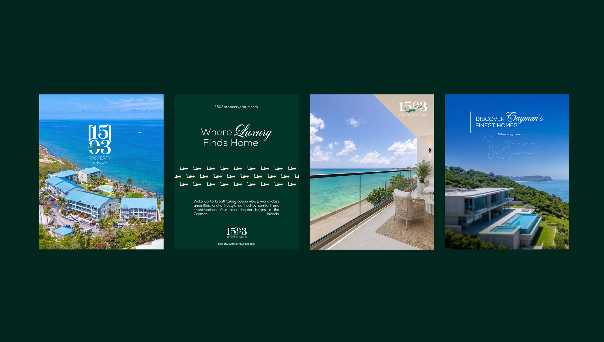
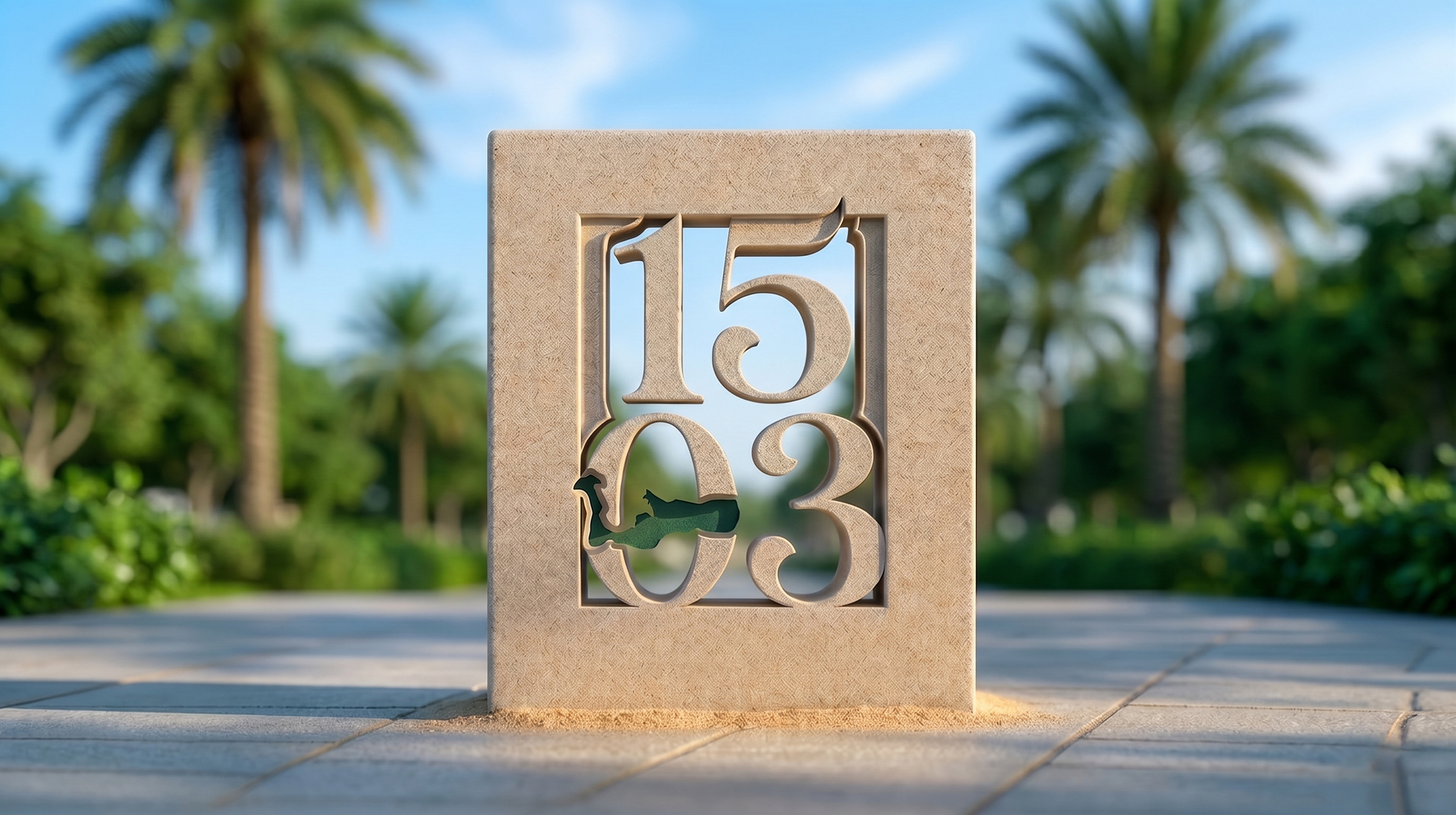
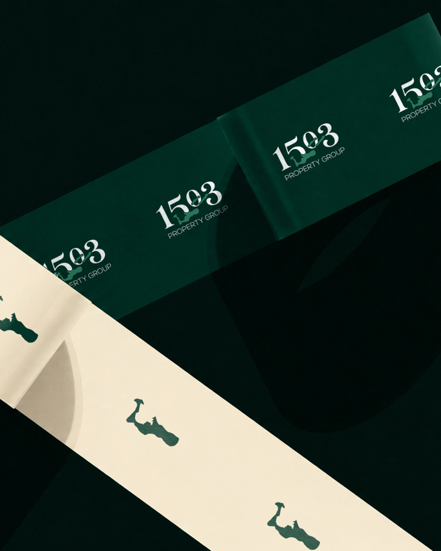
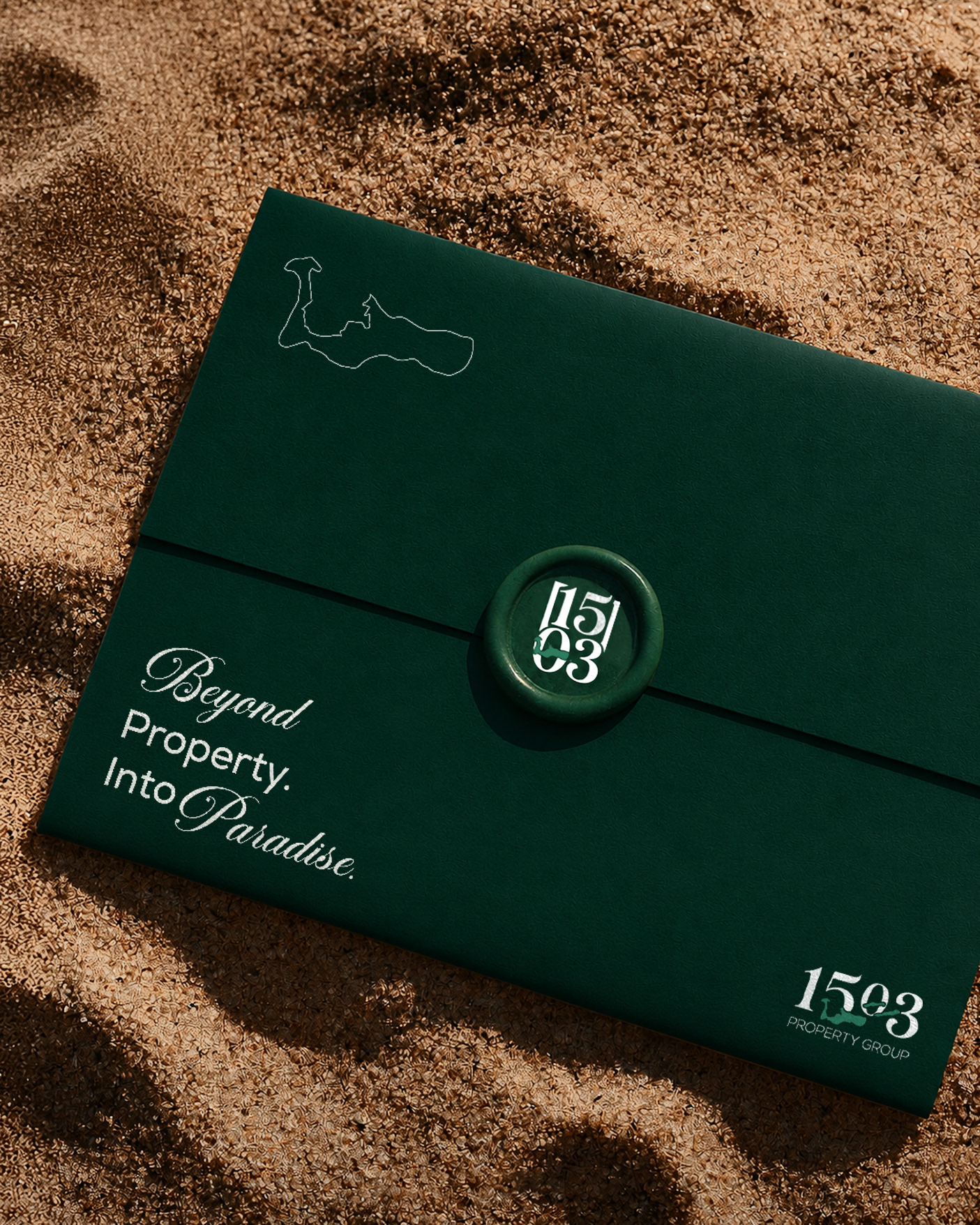
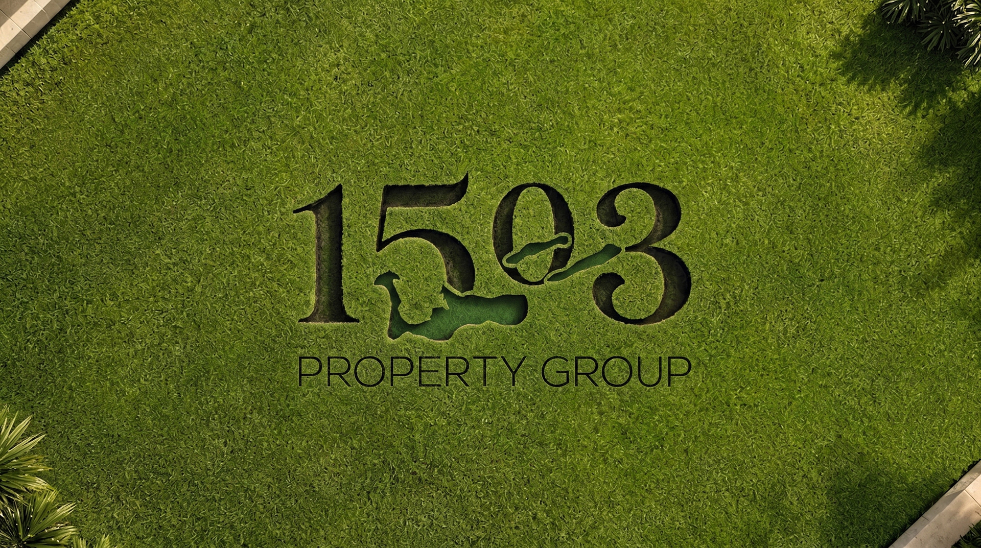
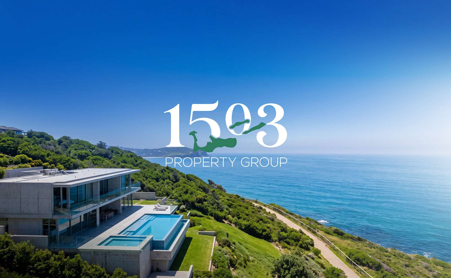
Island silhouette as icon — Grand Cayman's landmass is abstracted into the "0" of 1503 and used as a recurring mark across signage, merchandise, and packaging — turning a real estate brand into a place-based brand.
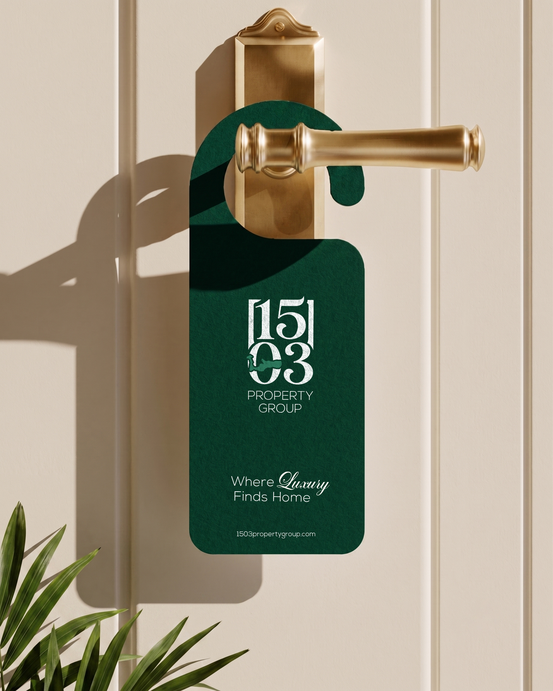
1503 as a monogram — set in a tall editorial serif (Nexa), giving it the authority of a heritage hospitality brand rather than a typical agency logo.
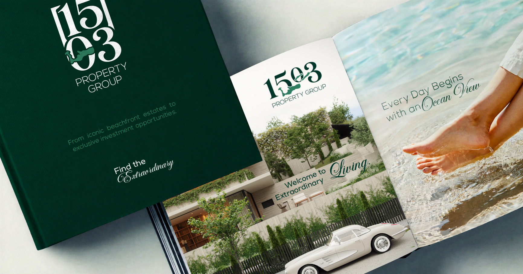
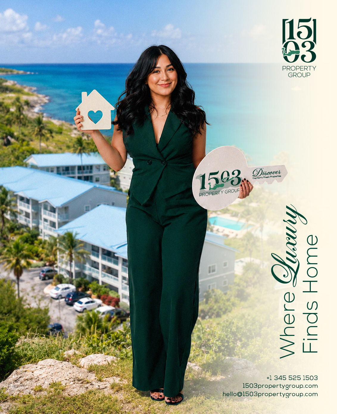
Script as the emotional layer — used sparingly for lines like "Where Luxury Finds Home", warming the system against the structured wordmark.
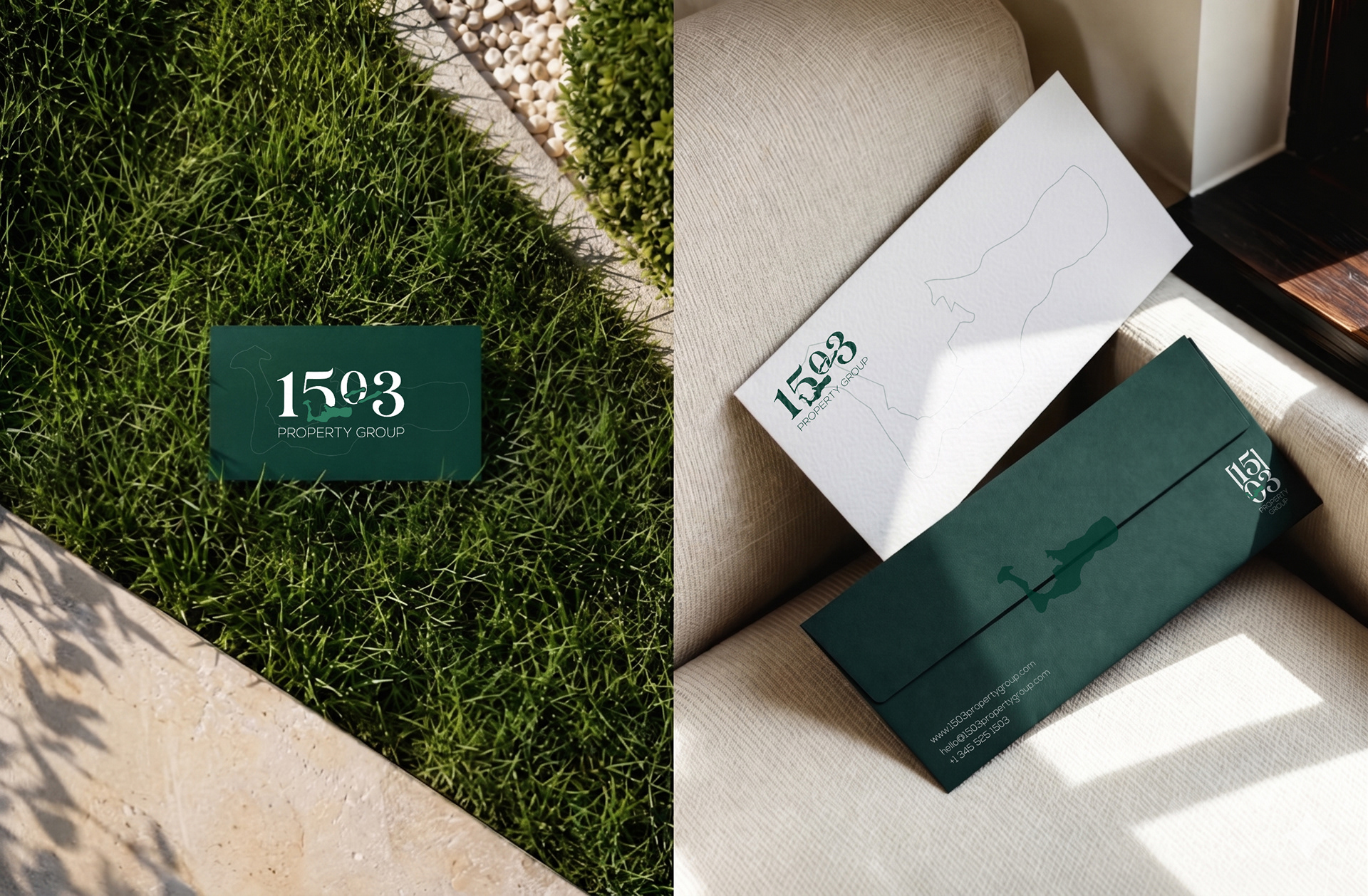
Earth Green + Linen over gold + navy — a deliberate departure from the luxury real estate cliché, reading coastal and collected rather than corporate.
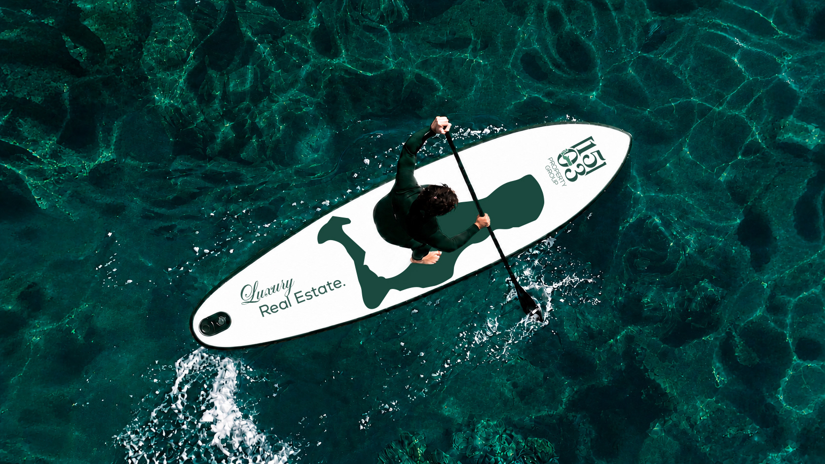
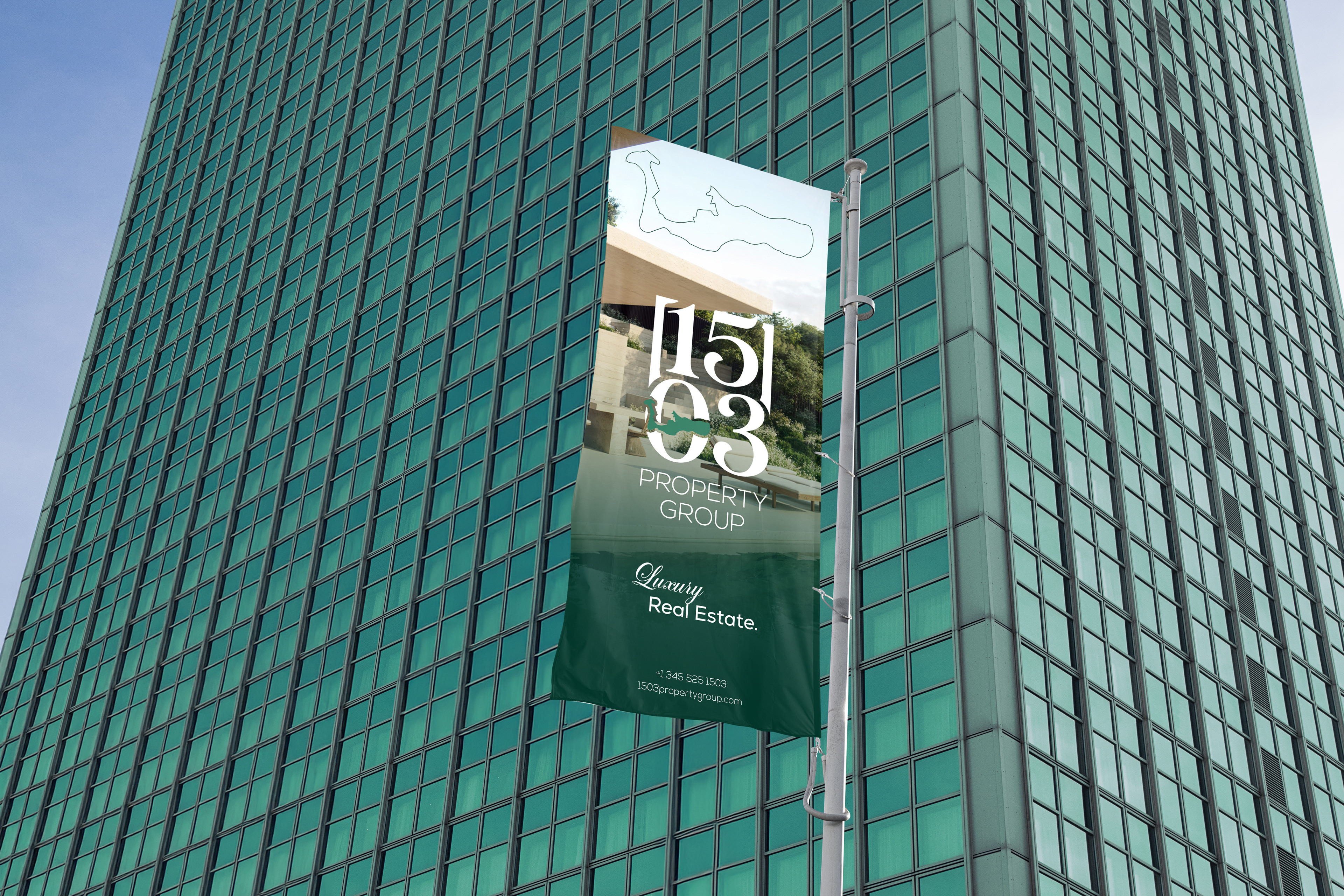
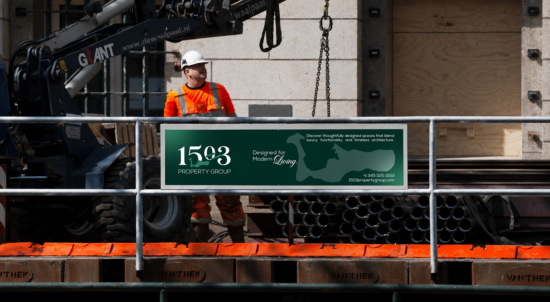
Built to live everywhere — stress-tested across cards, signage, vehicles, apparel, and architecture, proving the mark holds from a wax seal to a building façade.